TIGI - Hair Reborn
Producing a parallax website without blowing the performance budget
Having based their site on a technique I demonstrated in a blog tutorial in 2012, TIGI International asked me to develop the JavaScript functionality of the TIGI - Hair Reborn website. There were a large amount of animations that meant maintaining performance was top priority.
Responsibilities
- Semantic HTML
- Responsive CSS
- jQuery
- Parallax Animation
- Performance
I used a combination of custom JavaScript and third party jQuery plugins. I also assisted with the HTML & CSS for the desktop version of the site, and wrote a separate stylesheet specifically for the site when being viewed on an iPad.
Ian has done a fantastic job overall. Not only the site is to design, the code is very clean and slick. Love the way he achieved the translations portion of the site.
Kalwinder Dohil, IT Manager at TIGI International
The TIGI International team and I implemented a parallax effect to make a user's time on the site very much a unique experience, one that represented the product range.

Aside from this parallax effect, I integrated a slider that allows each section of the site to move left and right, displaying more content about each product. The slider is automatically scrolled to when a user clicks on a link for a particular slide and although the site consists of only one page, each slide has a unique URL, making it possible to link to any slide internally or externally. As a user moves between slides on the page, their history is recorded by the browser allowing use of the back button, much like a multi page web site. This slider was also utilised for the "consultation" section of the site, in which a user can answer questions about their hair type, leading them to the most suitable product for them. The slider was modified to prevent advancing to the next slide until a question was answered.

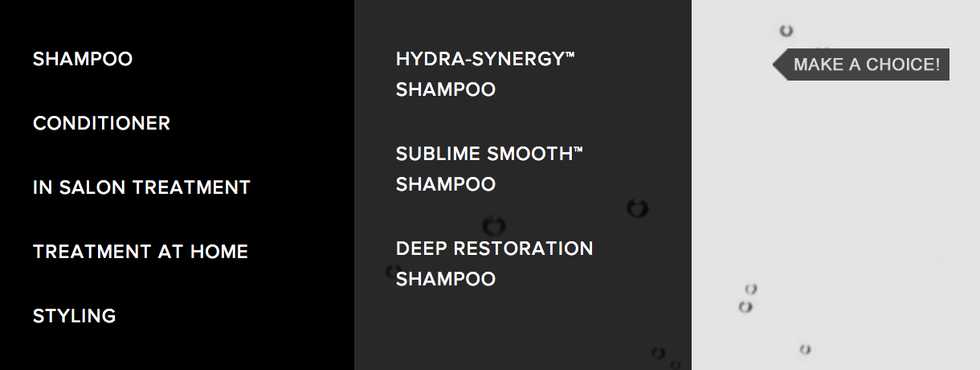
I also developed the "Product Overview" -- allowing the user to see all of the products within the TIGI range, the navigation, as well as what we termed the "sticky" sections -- when a section automatically animates to its vertical centre so it best fits the users screen.
Finally, TIGI International asked me to make it so that the site was optimised for the iPad in a way that would not detract from the desktop experience. Using JavaScript, I disabled the parallax effect -- which we deemed to be too performance heavy for the iPad -- and used media queries to serve a stylesheet specifically for the iPad whether it be held in landscape or portrait orientations.
Ian Lunn is a Front-end Developer with 12 years commercial experience, author of CSS3 Foundations, and graduate of Internet Technology. He creates successful websites that are fast, easy to use, and built with best practices.