Pet Plate
Working with Pet Plate over 5 years, from initial idea to now a company with a total investment fund of $13 million dollars
I was the designer and front-end developer for the initial Pet Plate website in 2015 and worked closely with the company as it grew over a period of 5 years. By early 2020, Pet Plate had successfully raised a total investment fund of $13 million dollars.
Responsibilities
- JavaScript
- React/Redux
- APIs
- Semantic HTML
- Responsive CSS
- WordPress
- SEO
- Performance Testing
- WCAG 2.1 AA compliance
- Browser Testing
- VWO (A/B Testing)
- GitHub
Updates
-
Updated to show Pet Plate's progress up to 2020.
-
Updated for 3 years of working on the Pet Plate website, describing Pet Plate's expansion and my responsibilities as the company has grown.
Pet Plate launched in August 2015, delivering on-demand freshly cooked meals for pets. I was involved with Pet Plate during its conception, providing design and responsive front-end templates that I integrated into a Ruby on Rails framework. I eventually focused on front-end development, coordinating with the back-end development and design teams to produce a strong user experience.
My main areas of focus were in producing the conversion flow in React, the My Account pages in jQuery (and later moving to React), and the marketing pages in WordPress,
Not only is Ian's work on-time and to spec, he pays attention to improve the aesthetics of the site as well as the functionality. Throughout the entire process he is responsive, and willing to work through issues as they arise. It's obvious he takes tremendous pride in his work, and I wouldn't hesitate to recommend or work with him again.
Renaldo Webb, Founder of Pet Plate
Creating the Conversion Flow
The conversion flow is where the user gives information about their pet, receive a recommended food plan, be given a choice of meals, and finally complete their subscription by checking out. This was obviously a hugely important part of the website.
The early versions of the conversion flow were HTML/CSS templates rendered by a Ruby on Rails server and relied on jQuery for interaction. In 2016, after Pet Plate's initial round of investment, I was responsible for front-end development of a newly redesigned conversion flow and opted to build using React and Redux. Given that the conversion flow acted like a survey, we created a single page application that would allow the user to quickly navigate through the questions and go back to make adjustments should they wish. This was a much faster way of navigation rather than having the server render each page as we previously had. The Ruby on Rails server became responsible for serving APIs that the front-end relied on to get and post data as necessary. We took special care to design the APIs in a way that meant we could interact with the server with minimal amount of wait time for the user. On a reliable connection, the only time the user had to wait was when their plan recommendation is prepared -- we actually manufactured a slight delay to give the impression some important calculations were happening.
Once the new conversion flow was built and released, we continued to make optimizations based on data analysis to improve the conversion rate and added new features to support the business such as the addition of add-on items.
Working with Pet Plate as it Grew
When Pet Plate first started in 2015, my involvement was typical of many other projects; I gave an estimate and time-scale for design and development and got the project live. Every once in a while, the founder would return to me with additional tasks or new problems that needed solving and we'd work together on a solution. In 2016, Pet Plate was picked up by an accelerator company and appeared on ABC's Shark Tank (USA's version of Dragon's Den for UK readers). I started spending more hours on the project as the company and its requirements grew.
Strong User Experience
My approach as front-end developer for Pet Plate was to advocate for the user, and by putting the user first, we achieved business goals as a result. Having a wide range understanding of the following can assist in achieving strong user experience:
- What the business aims to achieve, how that effects users and how changes presented to users can achieve those goals
- User expectation and how users currently interact with a business and its website
- The technical challenges faced when adding new features to an existing platform
- Use of new technology and how that can help achieve business goals
User Behaviour Research
Analysing user behaviour was an important part of improving Pet Plate. Tools such as Google Analytics, VWO, and Hotjar gave insights into users so we could learn about how they behave and interact with petplate.com to influence beneficial changes we could make to the website.
Testing
Testing the Pet Plate website as new features were added played an important part in achieving consistent growth. With each new release we relied on services such as BrowserStack for cross-browser compatibility to ensure the website works across a wide range of devices from mobile to desktop.
Our working process involved the use of smoke tests as well as release-specific tests that were carried out first by developers, then by a quality assurance team. Automated testing was achieved using tools such as RSpec on the back-end and Jasmine on the front-end. We retrospectively fixed bugs with use of Rollbar.
Maintaining the Website
Over the period of 5 years, the Pet Plate website under went a large amount of changes since its initial launch as the company and its requirements grew. We used GitHub for code management, Heroku for deployment, and Heroku's Review Apps feature for testing of features during development. We used tools such as Trello (later replaced by Asana) and GitHub issues to manage feature requests and bugs.
Working Closely with the Pet Plate Team
Most enjoyable for me on this project was working with the different departments of Pet Plate. I was able to work with designers to produce prototypes that would be used to generate discussion around each new feature that the larger team could then give their feedback and ideas towards. I also worked with the customer experience team to understand issues they faced. We were often able to make changes to the website to make things simpler fo the user which resulted in reducing the amount of time the customer experience team would need to spend answering customer queries.
2015 Design Process
When Pet Plate was first created, I produced the designs and built the front-end. What follows below is the case-study I wrote in 2015 for the original Pet Plate design.
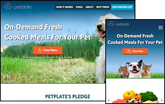
Designing a Website Appealing to User Emotion (2015 Case-study)
The major problems I had to overcome in the design process were how to:
- Engage a potential customer to want to purchase a product for their pet
- Explain the benefits of a non-typical pet food
- Explain the non-typical delivery process (for pet food)
Often when buying a product online we choose to do so because we understand how it benefits us or how it'd make us feel to receive that product when buying it for another person. Engaging a potential customer in this way with the Pet Plate design wasn't possible because the product is instead purchased for a customer's pet(s).
The customer wouldn't directly get satisfaction from the product so how would they benefit from it and how could that be used to present the product in a way that would engage the customer?
The Pet Plate website is designed to appeal to a user's emotion and connection to their pet. In purchasing products for our pets, we are connecting with them; we see their enjoyment and happiness, and it makes us happy too.
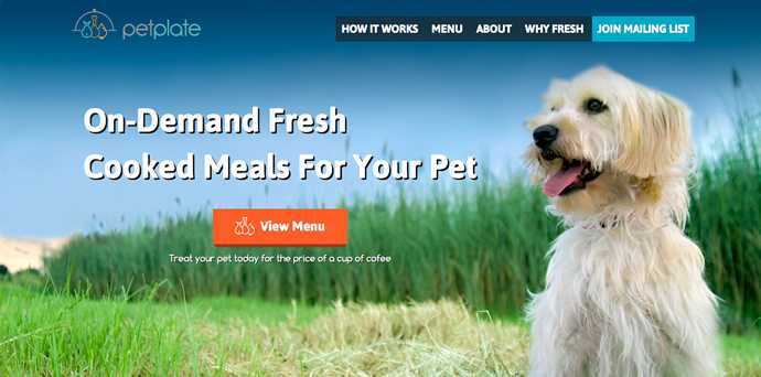
This is first seen in the hero section of the front page. Here I used a large image of a dog in a field with green and blue colours. The dog appears happy and healthy, representing the benefits of the product. The field suggests health and nature/natural, as well as representing an environment in which both pet and owner may be happy in -- on a walk for example. The image also complements the layout of the page, with the dog being in one-third, and the other two-thirds being filled with the content. Psychologically, we are more likely to look where other people/beings are looking so the dog is facing the title and call to action button to help draw the user's eye that way too.
The choice of green and blue colours were chosen to represent nature, health, and trust.
The call to action button leads the user into moving forward, viewing the meals and potentially making a purchase. The button is complemented with text that explains one of the product's benefits to further persuade the user to continue.
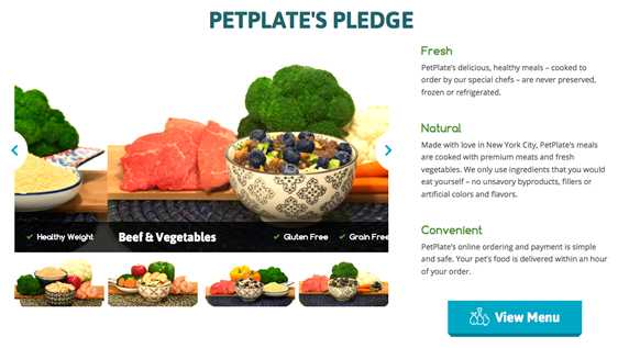
Below the hero section, benefits of the product are described, as well as a carousel showing images of each meal.
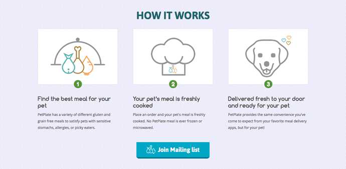
At this point on the front page, the product and benefits have briefly been described so now too is the process, broken down into three simple steps.
In both the product and process description sections, I used call to action buttons to tempt the user into making a purchase, once they felt they had enough information about the product.
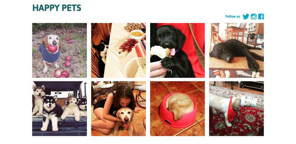
The front page then appeals to the user's connection with their pet(s) in the Happy Pets section. This serves several purposes:
- Shows how the product benefits the customer purchasing it (the happiness shared with their pet)
- Shows other customers that have already made purchases and are experiencing its benefits
- Builds trust by showing the product is used by others
- Promotes the companies social media presence and entices customers to share their images and help promote the company

On most pages, when the user is signed out, the footer is prefixed by another call to action. In this area, an image of various pets is used to tempt the customer to view the menu. Each pet was carefully chosen to appeal to the user and remind them of a connection they may have with their pet, representing the following:
- Watery eyed dog: A pet wanting or asking for something
- A cat licking his/her mouth: A pet that is fulfilled and happy
- A cat intently staring: A pet wanting or trying to catch/get something
The "cat intently staring" is purposely looking toward the call to action button to draw the user's eye and in a way that suggests she/he wants the user to view the menu and make a purchase.
The Pet Plate logo was designed by a third party.
Designing the Pet Plate website was a good opportunity to design for a product that doesn't directly benefit the buyer but instead engages with them on an emotional level; using a customer's connection with their pet(s) as metaphors for their interaction with a website too.
Ian Lunn is a Front-end Developer with 16 years commercial experience, author of CSS3 Foundations, and graduate of Internet Technology. He creates successful websites that are fast, easy to use, and built with best practices.