Design a Halloween Poster in Photoshop
Halloween's right around the corner. If your holding a party, you're going to want to advertise it and what better way than with a creepy looking A5 flyer/poster!
Read on to find out how to make your own Halloween poster in Adobe Photoshop.
Finding Stock Images
First things first, images! My party is called 'Skull Bash' so obviously I went for a picture of a skull. I wanted to have the skull being grasped by a hand and thrust toward the person looking at the picture.
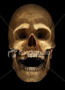
I really liked this skull from iStockPhoto. It's got the classic, creepy lit-from-below effect and I like the fact the mouth is open like the Skull is laughing. As this image is from iStockPhoto, you will need to pay for it but there's many other skulls for free on other sites such as sxc.hu.
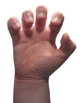
The hand was a freebie from sxc.hu and works really well with the skull when scaled to fit.
Set Up the Canvas
I'm going to make my poster A5 so it can be easily handed out too. You can find paper dimensions over on Wikipedia in case you're going to use a different size.
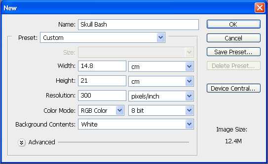
Open Photoshop and create a new document with your chosen dimensions and give it a resolution of 300dpi (ideal for printing).
Combining the Hand and Skull
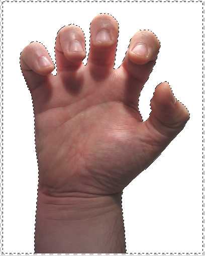
Place your chosen image of a hand onto the canvas and cut it out using the Magic Wand Tool.
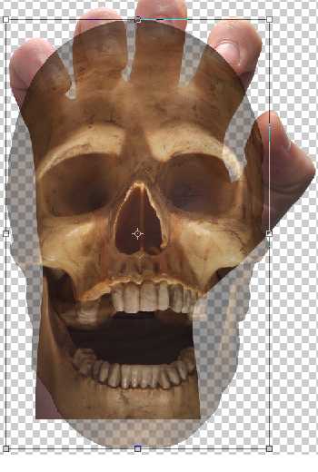
Use the Magic Wand Tool again to cut out your skull and place it over your image of the hand. Transform either image at this point to try and get them lined up so the hand actually looks like it's holding the skull. You can change the opacity of the skull to 50% to see the hand behind it to help with lining them up.
Applying a Mask to the Skull
So now our skull is over the hand, we need to bring only the tips of the fingers in front of the skull to make it look like it's got a grip around the skull. This is a really simple process done by using a layer mask. A layer mask will hide any areas of the skull we highlight.
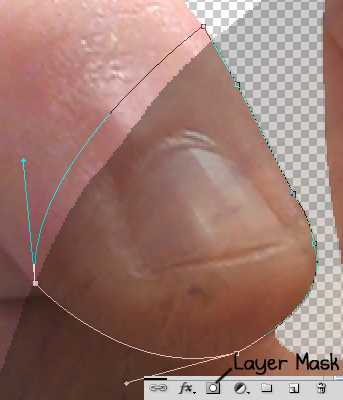
Set the opacity of your skull to 50% if it isn't already. This allows us to see the hand behind the skull. Click the skull layer and then click the 'Add vector mask' button at the bottom of the Layers pane. Now select the Pen Tool and carefully draw around the tip of the little finger that is over the top of the skull. In the image above, you can see I've carefully drawn an outline around the finger, the darker section is the skull set at 50%. Our vector mask will only apply to the skull, so outside of the skull (darker section), I didn't need to be precise with the outline the Pen Tool creates.
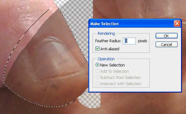
With the Pen Tool still selected, right click the path/outline you've made and choose 'Make Selection...', set the feather radius to 0 pixels and click OK.
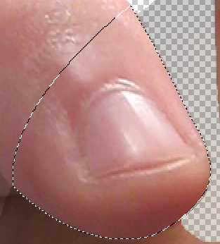
To finish off the vector mask for that finger, simply use the Paint Bucket Tool to fill the selection with black. That selected part of the skull will now become transparent and the finger will appear to be over the top of the skull. Set the opacity of the skull to 100% to take a look!
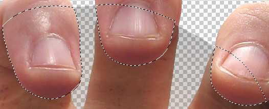
Use the same method described for the little finger to mask the next three fingers. If at any point your having issues, remember you must fill the selection with solid black. You should also check you have the layer mask selected when attempting to fill the selections (as opposed to the skull layer itself).
The thumb is a little trickier to get right. As the image of the hand isn't actually holding anything, there's no pressure applied to the fingers or thumb. That's fine for the fingers because the pressure point (where the object pushes in the flesh of the fingers a little) is underneath the tips, which if there were a natural picture of a hand holding something, we wouldn't be able to see anyway. We would be able to see that pressure being applied to the thumb though, and, as far as thumbs go, the thumb in this picture is a chubby one!
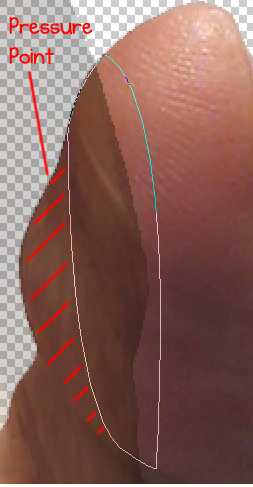
Using exactly the same method for the fingers, draw the outline of a vector mask but don't outline the entire thumb, leave some space where the object would be applying pressure to the thumb as shown by the red lines in the image above.
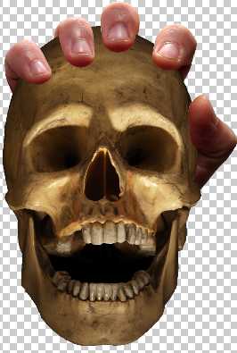
Change the opacity of the skull to 100% and you should now have a hand holding a creepy skull! You'll notice I chopped some of the wrist off of the hand so it doesn't come out below the skull.
Adding Realistic and Creepy Detail
Our skull in the hand is starting to look good although it's clear to see it's been manipulated because it doesn't look quite right yet. Let's add some shadow under the fingers.
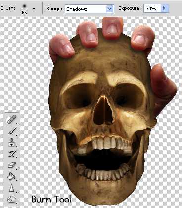
Select the Burn Tool and your skull layer in the Layers pane (make sure you're clicking the actual skull and not the vector mask). The Burn Tool is dead simple. Simply hold your mouse button down when you want to burn a particular area. Burning makes that area darker. Don't worry about applying it to the fingers, as long as you've got the skull layer selected, the fingers won't be burnt.
I've set my Burn Tool to:
- Diameter: 65%
- Range: Shadows
- Exposure: 70%
This allows me to just draw below each finger and creates a realistic looking shadow. Feel free to experiment with adjusting the settings of the Burn Tool -- if it doesn't burn enough the first time, you can just go over the area again to make it darker.
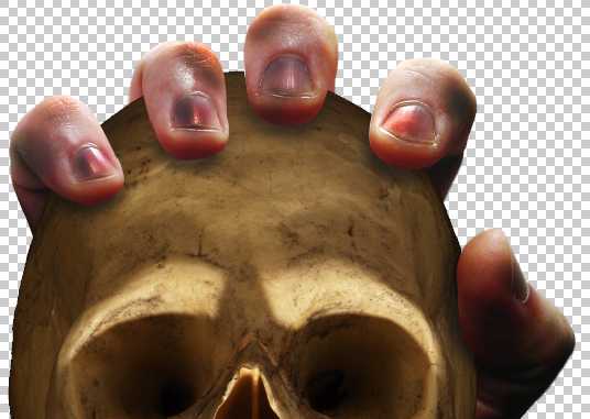
To further the realism of the hand, I adjusted the tone of the hand by selecting the hand layer and then clicking 'Image' > 'Auto Tone'. I used the Burn Tool again to make the hand look grubby. Burn the finger tips and certain parts of the fingers.
Adding Text to the Poster
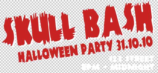
I found an excellent free font called Zombie that I chose to use for the text. If you want to use that, you'll need to save your work, close Photoshop, install it in your fonts directory and then open your Photoshop document again.
I rotated the title slightly to make it stand out a little more. I also duplicated the title text, moved into down and to the right about 20 pixels each way, and changed the colour to give it a drop shadow effect. This could be done using the Blending Options but I wanted to give both the text and the shadow a texture.
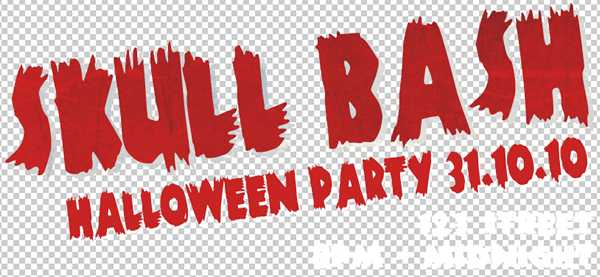
When you've place your text, right click the text layer in the Layers pane and click 'Blending Options...'. In the window that pops up check 'Pattern Overlay' and then use the options to apply a scratchy texture.
Adding a Background
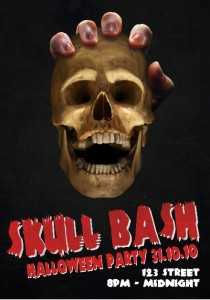
To add a background, start by placing a black layer behind everything, one that covers the entire canvas. Then add a funky looking texture over the top of that. I added this free starry sky texture and gave it an opacity of 40%. I also gave that starry sky layer a pattern overlay like we did with the text and used a scratchy texture again to give the paper a look of being old and distressed.
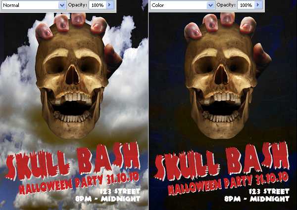
To set the red off in the text, I wanted to give the background a blue tint so I added this free cloud texture to the background and then change the blending mode to 'Color'.
Finally, I added a blue border around the entire poster using 'Inner Glow' in the blending options of a new layer.
Finishing Touches
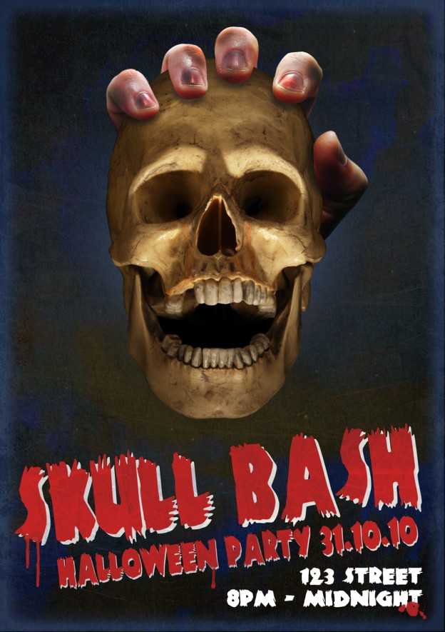
What's a Halloween poster without dripping blood? I got these awesome blood brushes for free and began splattering blood over the poster!
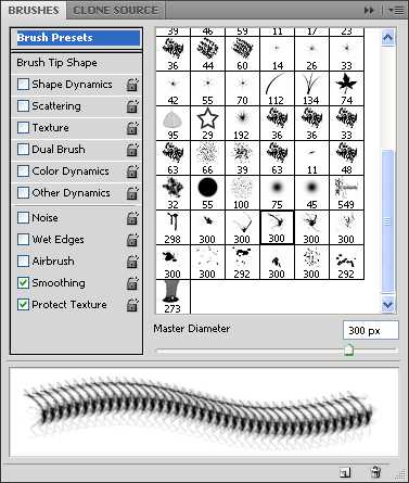
Once you've downloaded the brushes and added them to Photoshop, create a new layer and click the 'Brush Tool', also open the Brushes pane. Choose a brush and start going wild with the blood!
Ian Lunn is a Front-end Developer with 16 years commercial experience, author of CSS3 Foundations, and graduate of Internet Technology. He creates successful websites that are fast, easy to use, and built with best practices.