jQuery Vertical Parallax Background
You may have seen the parallax effect on quite a few websites now. In particular, the browser resize parallax effect on websites such as Silverback App and Elliot Jay Stocks (resize your browser horizontally to see the effect).
In this jQuery demo, we're going to take that effect a few steps further and make a website background have a parallax effect as we scroll down the page.
So let's get started. Firstly, download the necessary demo files. You'll find all of the code to work with as well as the images and the original vector in case you want to make things look different.
What is Parallax and How Does it Work?
According to Wikipedia: Parallax is an apparent displacement or difference in the apparent position of an object viewed along two different lines of sight.
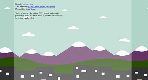
In our demo, the background will begin with a view of a city, and behind that, hills, mountains and the sky. As the user scrolls down, our effect will give them the feeling of moving upwards because the four backgrounds will move at different speeds to create this "difference in the apparent position of an object".
We'll use CSS3 multiple backgrounds and jQuery to move each background image independently as the user either scrolls or resizes the window.
The Images
All of the images are png format with a transparent background, they sit over the top of each other to give the impression it's just one background.


Because screen resolutions are continuing to grow, each image is carefully drawn to repeat seamlessly. For example, if you look at the hills, the right side of that image perfectly meets the left of the image in case it needs to repeat.
The HTML
The demo uses predominantly CSS3 and jQuery to create the effect, so HTML is minimal. Infact, aside from the skeleton of a HTML document, the only important code is this:
<!--[if !IE]><!-->
<script type="text/javascript" src="https://ajax.googleapis.com/ajax/libs/jquery/1.4.4/jquery.min.js"></script>
<script type="text/javascript" src="vertical-parallax.js"></script>
<!--<![endif]-->
This is our call to the jQuery library hosted on Google as well as the link to the code we've created for the purpose of the demo. You will notice it is wrapped inside a conditional statement. That statement specifically states that the JavaScript should not be called if the browser calling it is Internet Explorer. Why? Because as we all know, Internet Explorer is a terrible browser. Not only does it not support the CSS3 we need for this demo, it struggles with the jQuery too. Don't worry though, we will serve a nice "fallback" version for Internet Explorer to use so the demo doesn't appear broken. We'll come to that shortly.
<link href="style.css" rel="stylesheet" type="text/css" />
The only other important line of code is the link to our stylesheet.
The CSS
We're going to use a combination of CSS2 and CSS3. CSS3 for the browsers that support it and CSS2 as a "fallback" measure for those that don't.
html{
    background: url(images/bg.jpg) 0 0 fixed;
    background: url(images/bg-city.png) 0 550px repeat-x,
        url(images/bg-hills.png) 0 480px repeat-x,
        url(images/bg-mountains.png) 0 350px repeat-x,
        url(images/bg-sky.png) 0 0 repeat-x #336600;
}
We will begin by applying backgrounds to the HTML element. Firstly, in case the browser doesn't support CSS3 multiple backgrounds, we'll apply a fixed background. Should the browser support CSS3, this first line of code will be overwritten and 4 background images will be used to make up our parallax background.
Each background is given a position from the top to create a landscape and hopefully the perception of distance. All images are repeated horizontally just in case the users screen resolution is wider than the images.
That's really all we need for the demo but just to make it more like an actual website, we'll style the body too.
background-color: white;
background-color: rgba(255,255,255,0.3);
height: 2000px;
margin: 0 auto;
padding: 10px;
width: 960px;
Our first line gives the body element a white background color using CSS2. If the browser supports CSS3 though, we can give it a cooler looking background with an opacity of 0.3.
For the purpose of the demo the height is set to 2000px (feel free to experiment with height), and then the body is centred, given a padding of 10px and width of 960px.

If you're following along, try taking a look at what we have so far in a browser that supports CSS3. I recommend Google Chrome. If you begin to scroll in the preview, the background won't yet behave as we want it to because we haven't applied the jQuery. Note though, that this is how the demo will look if the browser is Internet Explorer or JavaScript is disabled -- it gracefully degrades so the user wouldn't know they are missing out on this awesome little effect.
The jQuery
Now to put in the engine that drives the effect. We're going to have three events that change how the effect behaves; document ready, scroll and resize. Should a user load or refresh the page, we need to make sure the 4 background images are in the correct position and when scrolling or resizing, we need to dynamically move each image with the movement of the scrollbar or window.
Document Ready
If you've written jQuery before, you'll know exactly what document ready is. It's when the document is ready! So, when the browser has finished rendering HTML and loading images etc, the jQuery will then kick in.
We need to position each background image when the document is ready because a window could be any size and we need the images to sit in a certain position relative to that size.
windowHeight = $(window).height();
city = windowHeight * 0.675;
hills = windowHeight * 0.625;
mountains = windowHeight * 0.350;
sky = 0;
So when the document is ready, we first get the height of the window. Then we can multiply that height by a certain value to get the position for each background image. So, in the case of the city image, I want it to be placed roughly seven tenths down the page. The hills six tenths and the mountains three tenths. The sky is set to zero because it will be positioned at the very top of the window. If for example, the window height is 1000px then the city will be positioned 675px from the top. Doing it this way always gives a nice ratio so no matter what the window height, the effect always works well.
Note that these values are being stored in variables to make the code cleaner. We can now use the variables in our next line:
$('html').css({
"background" :
    "url(images/bg-city.png) 0 " + city + "px repeat-x,
    url(images/bg-hills.png) 0 " + hills + "px repeat-x,
    url(images/bg-mountains.png) 0 " + mountains + "px repeat-x,
    url(images/bg-sky.png) 0 -" + sky + "px repeat-x #336600"
});
This code changes the CSS of the HTML element to readjust the position of each background image. It's exactly the same as the code in our CSS except the Y position for the image has been replaced with a variable.
Each time the document is ready, the code figures out the position of each image in relation to the window, saves that value in a variable and then the CSS is changed to reflect that new variable value.
Scroll and Resize
Let's skip lines 28 to 38 for a second as that is a function that the jQuery won't run until it is specifically requested.
$(window).resize(function(){
    Move();
});

$(window).bind('scroll', function(){
    Move();
});
This code is self explanatory, when the window is resized or the user scrolls, trigger the Move() function. The reason I put the code into a function is because each event uses exactly the same code so it made more sense to only write it once.
Now let's go back to line 28 - 38 and see what the Move() function does.
function Move(){
    windowHeight = $(window).height();
    pos = $(window).scrollTop();
    city = windowHeight * 0.675 + pos * 1.1;
    hills = windowHeight * 0.625 + pos * 0.7;
    mountains = windowHeight * 0.350 + pos * 0.51;
    sky = 0;

    $('html').css({
        "background" :
        "url(images/bg-city.png) 0 " + city + "px repeat-x,
        url(images/bg-hills.png) 0 " + hills + "px repeat-x,
        url(images/bg-mountains.png) 0 " + mountains + "px repeat-x,
        url(images/bg-sky.png) 0 -" + sky + "px repeat-x #336600"
    });
}
Looking familiar right? It's almost exactly the same to the document ready event but with a few extra adjustments to make the position for each image slightly different.
windowHeight = $(window).height();
pos = $(window).scrollTop();
Again, we get the window height, this time though, we also get the position of the scroll bar.
city = windowHeight * 0.675 + pos * 1.1;
We work out the initial place for each image in relation to the window size, but we also add on the position of the scroll bar (with the variable pos).
To make each image move slightly different in relation to the rest, we also multiply the figure with an adjuster value. In the case of the city image, that's 1.1, so it moves a tenth faster than the scrollbar.
The hills move three tenths slower than the scroll bar (0.7) and the mountains almost half (0.51) that.
$('html').css({
    "background" :
        "url(images/bg-city.png) 0 " + city + "px repeat-x,
        url(images/bg-hills.png) 0 " + hills + "px repeat-x,
        url(images/bg-mountains.png) 0 " + mountains + "px repeat-x,
        url(images/bg-sky.png) 0 " + sky + "px repeat-x #336600"
});
Again, these values are stored in variables and then applied to the CSS every time the browser is resized or the window is scrolled.
Conclusion
CSS3 and jQuery combined are opening up many new possibilities for little techniques like this one. Hopefully, this demo has given you many ideas for cool tricks of your own. Feel free to use this code and improve upon it. If you make something exciting, I'd love to see it! Leave a link in the comments section below.
Ian Lunn is a Front-end Developer with 16 years commercial experience, author of CSS3 Foundations, and graduate of Internet Technology. He creates successful websites that are fast, easy to use, and built with best practices.