Design Desktop Wallpaper in Illustrator
In this tutorial we're going to take a lot at how to design desktop wallpaper in Adobe Illustrator, specifically, desktop wallpaper for Smashing Magazine's monthly calendar series.
Smashing Magazine is the web's biggest resource for web professionals. Each month they feature a wide range of desktop wallpaper calendars submitted by their readers. As a designer, it's a great opportunity to show the world what you're capable of, gain some exposure and get that all important link back to your website!
According to Smashing Magazine, wallpaper is listed by artistic merit and only submissions demonstrating such merit will get posted. With around 50 wallpapers submitted each month, its worth putting in the effort to make sure you get listed. The higher up the page you are, will most likely get you more visitors than those lower down.
The Rules
Before we begin, let's take a look at a few of the important rules set by Smashing Magazine.
- design a wallpaper in the following resolutions (as many as possible, minimum 5): most popular resolutions are 1280×800, 1680×1050, 1440×900, 1280×1024, 1920×1200, 2560×1440, 1920×1080, 1024×768 px and 320×480px (iPhone) or 1024×1024px (iPad)
- design wallpapers in two versions: the ones which contain a calendar for the upcoming month and the ones which don’t contain it
- make sure the wallpapers contain a Smashing Magazine logo
The above three rules are the most important as it means we can design for different resolutions and requirements as we go along rather than having to try and modify toward the end of the design.
Most important are the resolution requirements. To make things simple, we'll design for the biggest resolution (2560 x 1440) and shrink down the final version to make the smaller ones. It's also worth trying to create your desktop wallpaper using vectors where possible -- they'll downscale (and upscale if needed) without the loss of quality.
We'll go into exporting our design in various resolutions later on. Just remember, the whole process will be easier designing for the biggest resolution you plan to submit, then the smaller resolutions can be down scaled without too much hassle.
Choosing a Theme and Style
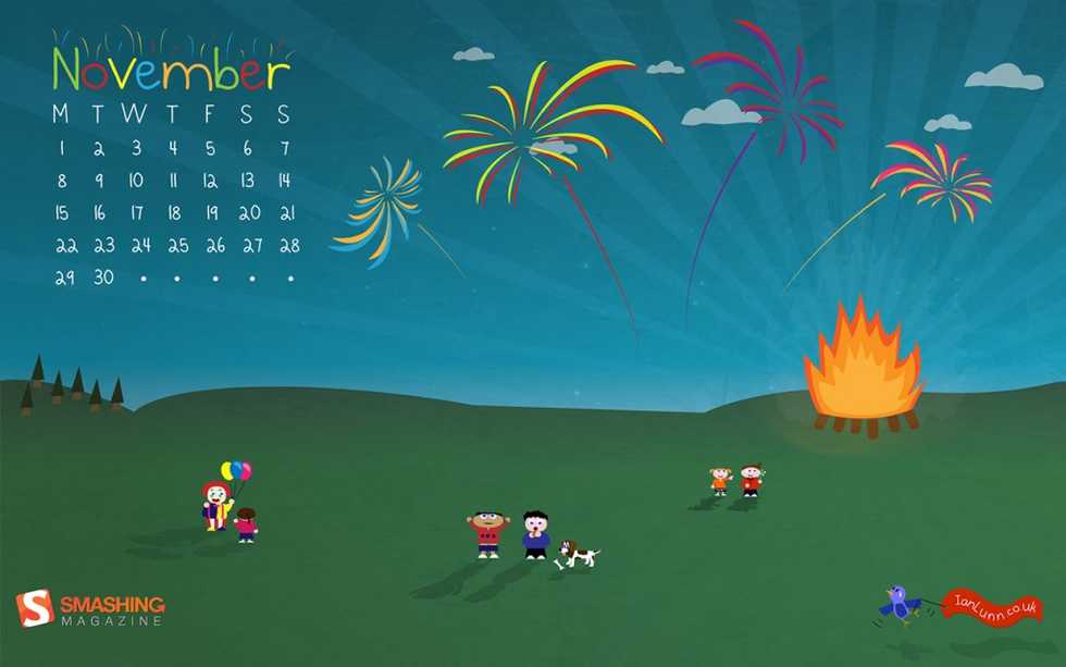
As November is fast approaching, I decided to go for a bonfire night theme. In England, on the 5th of November, we celebrate Guy Fawkes where we light bonfires and let off fireworks. So I chose that as my source of inspiration.
As for the style, I recently redesigned my website and went for a completely different look in comparison to my old one that was a lot more illustrated. I decided to use some of the illustrations from my old site.
Remember, submitting a wallpaper will put your talent onto a hugely popular website so it's important to choose a theme and style suited to you, one you feel passionate about and one that best shows off your creativity and personal style.
This tutorial will cover lots of techniques you can use and adapt to make your very own illustrated wallpaper.
Drawing the Background
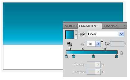
Begin by making a new document with the size of 2560 x 1440. Using the rectangle tool, draw the sky onto the artboard and give it a blue gradient.
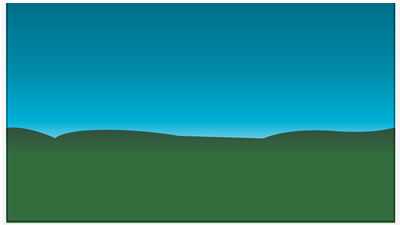
Now using the pen tool, draw a wavy line across the bottom of the sky rectangle.
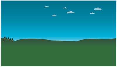
We'll also use the pen tool to start adding a little detail to the background in the form of trees and clouds.
Drawing the Characters
Our characters are made using the pen tool and a few shapes such as the elipse. I recommend you draw one generic character then use that to make the rest. Let's take a look.

Select the 'Ellipse Tool' and draw the face. Then draw two smaller ellipses inside for the eyes and a further ellipse inside each of those for the pupils. Add some colour and we have a face to work with!
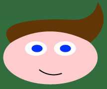
Using the 'Pen Tool' add a few extra details such as a smile and the hair.
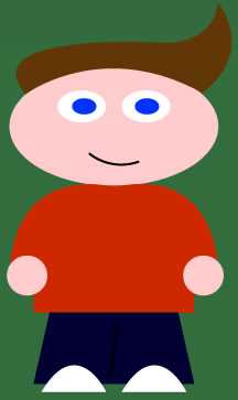
Now we have a head, it shouldn't be too hard to draw a body in proportion. Using the 'Pen Tool' again, draw a path for the top of the body, then a path for the legs. Add some further detail, such as hands and shoes.
This character will now be the base for the rest of our characters. The pen tool will allow us not only to add more and differing details but also change the shape of the base character. It's easiest to select all of the objects that make up the base character, group them and then duplicate the group by holding Alt and dragging the group.
Drawing the Fireworks and Bonfire

The fireworks are made up of paths drawn using the 'Pen Tool'. Once you've selected the 'Pen Tool' draw a path from the centre of where you want the firework to be then continue doing this around the centre until you've got a complete circle as above.
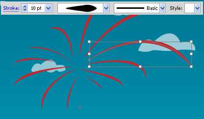
To make the firework look like it's exploding from the centre, we'll apply a variable width to each stroke. I've chosen to give each stroke a varying width from 3pt to 10pt. All paths have the width profile set to 5 (kind of like a sideways tear drop). If you drew each path from the centre outwards, each path will get wider toward the end. If that isn't the case for you, or you just want to experiment, open the 'Stroke' palette by clicking 'Window' > 'Stroke' or press CTRL + F10. Once open, next to the 'Profile' drop down you'll see a button called 'Flip Along', click that and the path will change to become wider at the centre of the firework and thinner on the outside.

Once you're happy with the burst of the firework, group each path, duplicate the group, move it a way just a few pixels (along both x and y), and finally change the colour to make the firework more interesting looking.

Now all we need to do is add the trail of the firework. Use exactly the same method we used to draw each bursting path of the firework. Select the 'Pen Tool', draw from the ground up towards the firework and apply a width profile. I choose width profile 4.
To make more fireworks, simply duplicate/copy and paste the firework we've already made, change the size and colour, and then rotate the burst to make each one look unique.
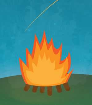
The bonfire is made using the pen tool. Simply draw a flame and then duplicate that flame a couple of times, reduce each to sit within each other and then change the colours slightly.
Making the Calendar

Using the 'Type Tool' start by typing out the month your calendar is going to be based on. Then, add a textbox for each day of the week. It's important each day of the week is in it's own textbox so we can align them correctly.
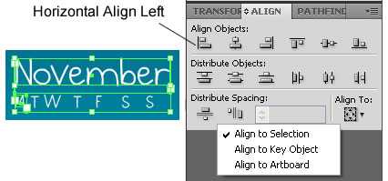
To align 'M' to meet the edge of November, select the 'M' and 'November'. Open the 'Align' box by clicking 'Window' > 'Align' or Shift + F7. Make sure 'Align To:' is set to 'Align to Selection', then click 'Horizontal Align Left' under 'Align Objects:'.

Now we will align the 'S' of Sunday to the right of 'November'. Select the 'S' and 'November' (make sure 'M' isn't selected anymore), go to the 'Align' box again but this time click 'Horizontal Align Right' under 'Align Objects:'.

Once the 'M' and 'S' are aligned, it's easy to align the rest perfectly. Highlight all of the letters including 'M' and 'S' (but not 'November' this time). In the 'Align' box, under 'Distribute Objects:' click 'Horizontal Distribute Center'. Et voila! The weekdays are now perfectly aligned under November. Repeat the above process for the numbers of the calendar.
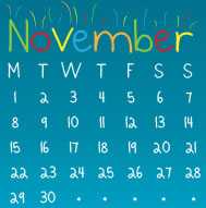
Using similar techniques we used in the fireworks section of this tutorial, we can also adding some fancy little effects to the word November.
Adding Texture
Texture can really make a picture come alive and adds not only personality but more interest too.
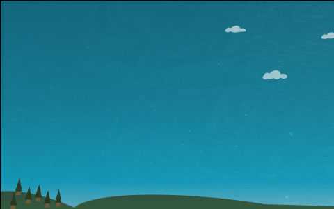
I added a starry sky and grain texture to the sky. Simply by placing the textures in the respective layers. To do this, click 'File' > 'Place...', then select the texture you want to use and click 'Place'.
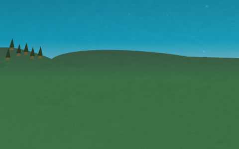
The hills also have a grainy texture but they were added using a different technique. The reason for this was because the hill is a layer that sits over the top of the sky layer. If I had of added a texture using the 'Place...' method used above, the texture would have overlapped with the sky and looked messy. To get around this, I used an opacity mask on the hills.
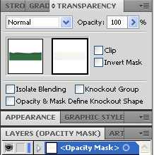
To use an opacity mask, click the hills object then open the 'Transparency' box by clicking 'Window' > 'Transparency' or Shift + Ctrl + F10. In the 'Transparency box, click the 'Opacity Mask' and then 'Place...' your texture as described above. The texture will now only be applied to the object you selected.
Adding Light Effects
Lighting will give your illustration a great finishing effect that will bring the scene to life. In my scene, there's two forms of lighting; radial light, and object shadow.
Radial Light

The radial light are the spokes of light coming from the bonfire and stretching across the sky.

Start by drawing a tall rectangle on the artboard. Using the 'Direct Selection Tool', delete the bottom right anchor of that rectangle. Select the bottom left anchor and move it to the middle of the shape to make a very long triangle as shown above. Now duplicate this object then 'Reflect' the duplication by clicking 'Object' > 'Transform' > 'Reflect...', then click 'Horizontal' and 'OK.'

Select both objects and duplicate them, then rotate them 90 degrees.

Now select all four objects, duplicate them and rotate 45 degrees and you should have as shown above. This is the basic principal to creating radial light. In my wallpaper, I chose to make each spoke slightly 'off'. Rather than being a perfect circle of light, some spokes aren't centred with others in an attempt to give the impression of the bonfire flickering.
Object Shadow

Object shadow is the shadow created by the foreground objects such as the characters in the scene. To start, group the objects that make up a character then duplicate that group and change the fill color to black.
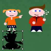
With the group selected, drag the top control point of the group down.
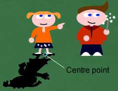
Now select the 'Shear Tool'. Click the centre point in the group and then move it to the point where the bottom of the character meets the shadow. Now drag the shadow in the direction you want the shadow to be cast.
Exporting to Various Resolutions
Once your wallpaper is finished, you'll need to start exporting it at numerous sizes. This can be quite a complex and time intensive process, especially if you're going to offer a wallpaper for every resolution. Here though, is my procedure which I believe is the quickest and most stress free way.
I worked out the ratio for each resolution (bear with me on this, it does save time), which is as follows (resoluton/ratio):
- 2560 x 1440 / 1.777
- 1920 x 1440 / 1.333
- 1920 x 1200 / 1.6- 1920 x 1080 / 1.777
- 1680 x 1200 / 1.4
- 1680 x 1050 / 1.6
- 1600 x 1200 / 1.333
- 1440 x 900 / 1.6
- 1400 x 1050 / 1.333
- 1280 x 1024 / 1.25
- 1280 x 960 / 1.333
- 1280 x 800 / 1.6
- 1280 x 720 / 1.777
- 1152 x 864 / 1.333
- 1024 x 1024 (iPad) / 1
- 1024 x 768 / 1.337
- 800 x 600 / 1.333
- 800 x 480 / 1.666
- 640 x 480 / 1.333
- 320 x 480 (iPhone) / .479
You'll notice a lot of the resolutions share the same ratio. So rather than make a new document for every resolution, we'll just make a document for the highest resolution in a ratio group.
Exporting the Original File
Starting with 2560 x 1440 (ratio of 1.777) we can export that as a jpg. Then change the size of that jpg for the rest of the resolutions in the 1.777 group.
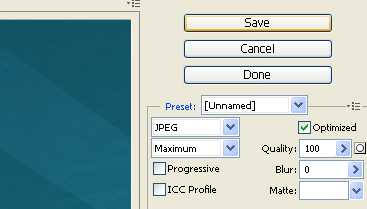
Click File > 'Save for Web & Devices'. Make sure quality is set to 100 as shown above then hit 'Save'. Name your first export according to Smashing Magazine's naming convention: "month-year-[filenameshortcutofthetheme]-[calendar/nocal]-[resolution].[jpg/png]".
Making Smaller Sized Wallpaper
Now for the rest of the resolutions in this ratio group of 1.777:
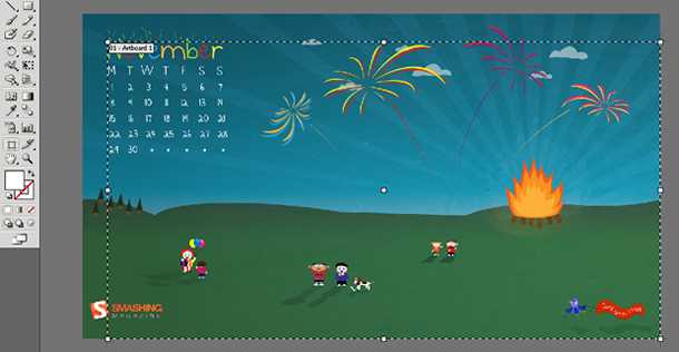
Open the exported image file in Illustrator. Edit the size of the artboard so it matches the image size of 2560 x 1440. Now, we 'Save for Web & Devices' again.
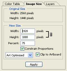
In 'Save for Web & Devices' this time, we will change the image size to make our second wallpaper sized at 1920 x 1080. Click the 'Image Size' tab and type in the width of 1920. Make sure you have 'Constrain Proportions' checked and the image will stay in it's ratio of 1.777. Apply the new size then export the file and name it according to Smashing Magazine's naming convention again.
Repeat these steps (Making Smaller Sized Wallpaper) for every wallpaper in the ratio group of 1.777.
The reason I'm exporting the first image then resizing the jpg for the following sizes of wallpaper is because Illustrator can take quite a while to generate it's preview in the 'Save for Web & Devices' window. Once you apply a new size, Illustrator will then generate a preview of that new size too. If your wallpaper design contains a lot of objects - as does mine - exporting a wallpaper in this way, for every resolution, can get very time intensive.
Reducing the Original Art for Different Ratios
We're not quite done exporting yet. We've got some more ratio groups to work with. We'll now do the 1.6 ratio group starting with the highest resolution in that group, 1920 x 1200. Let's open our original illustrator file sized at 2560 x 1440 again.
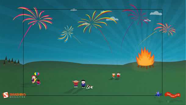
Firstly, make a new copy of this Illustrator file by saving it, naming it something like wallpaper-1920x1200.ai. Now change the artboard size to 1920 x 1200.
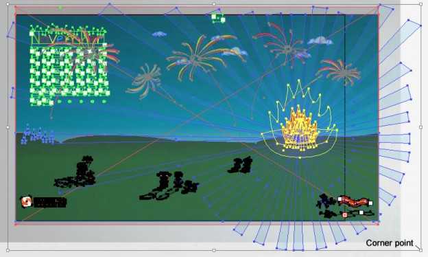
You'll see the artwork remains at 2560 x 1440 and over hangs the artboard. Make sure you have all layers visible and unlocked, then select all by pressing CTRL + A. Now, reduce the size of every object by clicking the corner point of the selected objects and moving in toward the centre of the artboard. Keep moving until the height of the art matches the height of the artboard.
Because this ratio group is slightly smaller than the previous one, there will be an overhang on the sides of artboard. You'll either need to move each object inside of the artboard or reduce the size of certain objects to make it fit. I personally did a bit of both. I moved foreground objects without reducing their size but for the background such as the hills and sky, I just shrunk the width a little bit.
Once you've got the art into the artboard and you're happy with the layout, repeat the above mentioned steps (Making Smaller Sized Wallpaper) to produce each size of wallpaper for resolutions with the ratio of 1.6.
You'll then need to begin with the ratio group of 1.333, following the steps mentioned in Reducing the Original Art for Different Ratios and continue until you've done every ratio group.
Ian Lunn is a Front-end Developer with 16 years commercial experience, author of CSS3 Foundations, and graduate of Internet Technology. He creates successful websites that are fast, easy to use, and built with best practices.